Bootstrap - Tables
Bootstrap

In this tutorial we will learn to style tables in Bootstrap.
The table class
To style a table in Bootstrap we can add the .table class to the opening table tag.
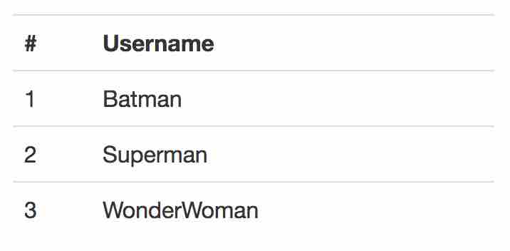
<table class="table">
  <tr>
    <th>#</th>
    <th>Username</th>
  </tr>
  <tr>
    <td>1</td>
    <td>Batman</td>
  </tr>
  <tr>
    <td>2</td>
    <td>Superman</td>
  </tr>
  <tr>
    <td>3</td>
    <td>WonderWoman</td>
  </tr>
</table>
Output:
Striped rows
To get striped rows in the table add the .table-striped class to the opening table tag.
<table class="table table-striped">
  <tr>
    <th>#</th>
    <th>Username</th>
  </tr>
  <tr>
    <td>1</td>
    <td>Batman</td>
  </tr>
  <tr>
    <td>2</td>
    <td>Superman</td>
  </tr>
  <tr>
    <td>3</td>
    <td>WonderWoman</td>
  </tr>
</table>
Output:

Bordered table
To add border to the table add the .table-bordered class to the opening table tag.
<table class="table table-bordered">
  <tr>
    <th>#</th>
    <th>Username</th>
  </tr>
  <tr>
    <td>1</td>
    <td>Batman</td>
  </tr>
  <tr>
    <td>2</td>
    <td>Superman</td>
  </tr>
  <tr>
    <td>3</td>
    <td>WonderWoman</td>
  </tr>
</table>
Output:

Hover rows
To enable a hover state on table rows add the .table-hover class to the opening table tag.
<table class="table table-hover">
  <tr>
    <th>#</th>
    <th>Username</th>
  </tr>
  <tr>
    <td>1</td>
    <td>Batman</td>
  </tr>
  <tr>
    <td>2</td>
    <td>Superman</td>
  </tr>
  <tr>
    <td>3</td>
    <td>WonderWoman</td>
  </tr>
</table>
Output:

Condensed table
To make tables more compact by cutting cell padding in half we use the .table-condensed class in the opening table tag.
<table class="table table-condensed">
  <tr>
    <th>#</th>
    <th>Username</th>
  </tr>
  <tr>
    <td>1</td>
    <td>Batman</td>
  </tr>
  <tr>
    <td>2</td>
    <td>Superman</td>
  </tr>
  <tr>
    <td>3</td>
    <td>WonderWoman</td>
  </tr>
</table>
Output:

Contextual classes
We use the contextual classes to color table rows and individual cells.
| Class | Description |
|---|---|
.active | Applies the hover color to a particular row or cell |
.success | Indicates a successful or positive action |
.info | Indicates a neutral informative change or action |
.warning | Indicates a warning that might need attention |
.danger | Indicates a dangerous or potentially negative action |
We can use the classes in opening tr tag and in opening td and th tags.
<!-- On rows -->
<tr class="active"> some content </tr>
<tr class="success"> some content </tr>
<tr class="warning"> some content </tr>
<tr class="danger"> some content </tr>
<tr class="info"> some content </tr>

<!-- On cells (`td` or `th`) -->
<tr>
  <td class="active"> some content </td>
  <td class="success"> some content </td>
  <td class="warning"> some content </td>
  <td class="danger"> some content </td>
  <td class="info"> some content </td>
</tr>

<tr>
  <th class="active"> some content </th>
</tr>
Example:
<table class="table table-condensed">
  <tr>
    <th>#</th>
    <th>Description</th>
  </tr>
  <tr class="active">
    <td>1</td>
    <td>Some description</td>
  </tr>
  <tr class="success">
    <td>2</td>
    <td>Some description</td>
  </tr>
  <tr class="warning">
    <td>3</td>
    <td>Some description</td>
  </tr>
  <tr class="danger">
    <td>4</td>
    <td>Some description</td>
  </tr>
  <tr class="info">
    <td>5</td>
    <td>Some description</td>
  </tr>
</table>
Output:

Responsive table
To create a responsive tables we wrap any .table in .table-responsive. This makes the table scroll horizontally on small devices (under 768px).
<div class="table-responsive">
  <table class="table table-bordered">
    <tr>
      <th>#</th>
      <th>Username</th>
      <th>Current Status</th>
    </tr>
    <tr>
      <td>1</td>
      <td>Batman</td>
      <td>In Gotham city.</td>
    </tr>
    <tr>
      <td>2</td>
      <td>Superman</td>
      <td>Flying back from his planet Krypton to Earth.</td>
    </tr>
    <tr>
      <td>3</td>
      <td>WonderWoman</td>
      <td>In London.</td>
    </tr>
  </table>
</div>
Output:

ADVERTISEMENT