Bootstrap - Input Groups
Bootstrap

In this tutorial we will learn about input groups in Bootstrap.
We can extend form controls by adding buttons and text before, after, and on both sides of any text based <input>.
Addon
We can addon using the .input-group-addon class to a text based input field.
<div class="input-group">
  <span class="input-group-addon"
        id="basic-addon">@</span>
  <input type="text"
         class="form-control"
         placeholder="Enter your twitter handle"
         aria-describedby="basic-addon">
</div>
Output

<div class="input-group">
  <input type="text"
         class="form-control"
         placeholder="Enter your email address"
         aria-describedby="basic-addon">
  <span class="input-group-addon"
        id="basic-addon">@gmail.com</span>
</div>
Output

<div class="input-group">
  <span class="input-group-addon">INR</span>
  <input type="text"
         class="form-control"
         placeholder="Amount in Indian Rupee"
         aria-label="Amount (to the nearest Indian Rupee)">
  <span class="input-group-addon">.00</span>
</div>
Output

Sizing
We can change the size of the input group addon using the .input-group-lg and .input-group-sm class.
<!-- large size -->
<div class="input-group input-group-lg">
  <span class="input-group-addon"
        id="sizing-addon">@</span>
  <input type="text"
         class="form-control"
         placeholder="Enter your twitter handle"
         aria-describedby="sizing-addon">
</div>

<!-- default size -->
<div class="input-group">
  <span class="input-group-addon"
        id="sizing-addon">@</span>
  <input type="text"
         class="form-control"
         placeholder="Enter your twitter handle"
         aria-describedby="sizing-addon">
</div>

<!-- small size -->
<div class="input-group input-group-sm">
  <span class="input-group-addon"
        id="sizing-addon">@</span>
  <input type="text"
         class="form-control"
         placeholder="Enter your twitter handle"
         aria-describedby="sizing-addon">
</div>
Output

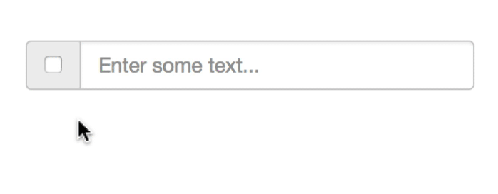
Checkbox addon
We can add checkbox as addon to a text input field.
<div class="input-group">
  <span class="input-group-addon">
    <input type="checkbox"
           aria-label="checkbox">
  </span>
  <input type="text"
         class="form-control"
         aria-label="text input"
         placeholder="Enter some text...">
</div>
Output
Radio addon
We can add radio as addon to a text input field.
<div class="input-group">
  <span class="input-group-addon">
    <input type="radio"
           aria-label="radio">
  </span>
  <input type="text"
         class="form-control"
         aria-label="text input"
         placeholder="Enter some text...">
</div>
Output

Button addon
We can add button as addon to a text input field.
<div class="input-group">
  <input type="text"
         class="form-control"
         placeholder="Search...">
  <span class="input-group-btn">
    <button class="btn btn-primary"
            type="button">Search</button>
  </span>
</div>
Output

Dropdown addon
We can add dropdown as addon to text input field.
<div class="input-group">
  <input type="text"
         class="form-control"
         placeholder="Search..."
         aria-label="...">
  <div class="input-group-btn">
    <button type="button"
            class="btn btn-primary dropdown-toggle"
            data-toggle="dropdown"
            aria-haspopup="true"
            aria-expanded="false"> Dropdown <span class="caret"></span></button>
    <ul class="dropdown-menu dropdown-menu-right">
      <li><a href="#">Menu Item 1</a></li>
      <li><a href="#">Menu Item 2</a></li>
      <li><a href="#">Menu Item 3</a></li>
    </ul>
  </div>
</div>
Output

Segmented button
We can create segmented buttons as addon to text input field.
<div class="input-group">
  <div class="input-group-btn">
    <button type="button"
            class="btn btn-primary">Button</button>
    <button type="button"
            class="btn btn-primary dropdown-toggle"
            data-toggle="dropdown"
            aria-haspopup="true"
            aria-expanded="false"> Dropdown <span class="caret"></span> <span class="sr-only">Dropdown</span> </button>
    <ul class="dropdown-menu">
      <li><a href="#">Menu Item 1</a></li>
      <li><a href="#">Menu Item 2</a></li>
      <li><a href="#">Menu Item 3</a></li>
    </ul>
  </div>
  <input class="form-control"
         placeholder="Enter some text..."
         aria-label="text input">
</div>
Output

Multiple buttons
We can add multiple buttons as addon to text input field.
<div class="input-group">
  <div class="input-group-btn">
    <button type="button"
            class="btn btn-default"
            aria-label="Cut">Cut</button>
    <button type="button"
            class="btn btn-default"
            aria-label="Italic">Copy</button>
    <button type="button"
            class="btn btn-default"
            aria-label="Italic">Paste</button>
  </div>
  <input class="form-control"
         aria-label="Text input"
         placeholder="Enter some text...">
</div>
Output

ADVERTISEMENT