Bootstrap - Labels and Badges
Bootstrap

In this tutorial we will learn about labels and badges in Bootstrap.
Creating labels
We use the .label class to create labels and then we style them using the following classes.
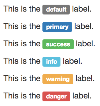
.label-defaultfor the default label.label-primaryfor the primary label.label-successfor the success label.label-infofor the info label.label-warningfor the warning label.label-dangerfor the danger label
<p>This is the <span class="label label-default">default</span> label.</p>
<p>This is the <span class="label label-primary">primary</span> label.</p>
<p>This is the <span class="label label-success">success</span> label.</p>
<p>This is the <span class="label label-info">info</span> label.</p>
<p>This is the <span class="label label-warning">warning</span> label.</p>
<p>This is the <span class="label label-danger">danger</span> label.</p>
Output:
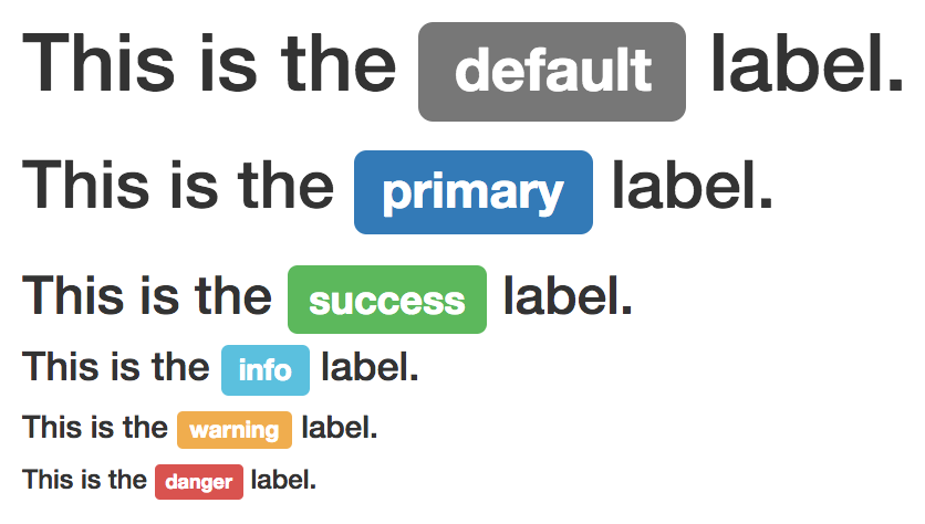
We can even add labels to heading tags as shown below.
<h1>This is the <span class="label label-default">default</span> label.</h1>
<h2>This is the <span class="label label-primary">primary</span> label.</h2>
<h3>This is the <span class="label label-success">success</span> label.</h3>
<h4>This is the <span class="label label-info">info</span> label.</h4>
<h5>This is the <span class="label label-warning">warning</span> label.</h5>
<h6>This is the <span class="label label-danger">danger</span> label.</h6>
Output:
Creating badges
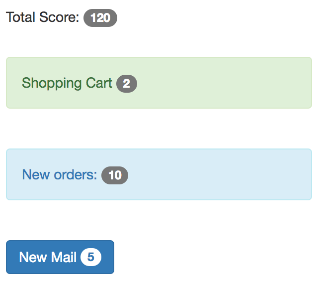
We use the .badge class to create badge.
<p>Total Score: <span class="badge">120</span></p>

<div class="alert alert-success">
  <p>Shopping Cart <span class="badge">2</span></p>
</div>

<div class="alert alert-info">
  <p><a href="#">New orders: <span class="badge">10</span></a></p>
</div>

<button class="btn btn-primary">
  New Mail <span class="badge">5</span>
</button>
Output:
ADVERTISEMENT