Bootstrap - Progress Bars
Bootstrap

In this tutorial we will learn about Progress bars in Bootstrap.
Progress bars are a best way to give visual information to a user about the progress of any task and Bootstrap provides us classes to create different type of progress bars.
Basic progress bar
To create a progress bar we use the .progress class.
<div class="progress">
  <div class="progress-bar" role="progressbar" aria-valuenow="60" aria-valuemin="0" aria-valuemax="100" style="width: 60%;">
    <span class="sr-only">60% Complete</span>
  </div>
</div>
Output:

Now, lets understand the above piece of code.
We have a parent div that encloses our progress bar so we have given it the .progress class.
Inside the parent div we have the child div which becomes the progress bar so it gets the .progress-bar class.
We want the progress bar to be 60% complete so we have set the width style to 60% by writing style="width: 60%" inline CSS style.
We can also see three aria attributes aria-valuenow="60", aria-valuemin="0" and aria-valuemax="100".
ARIA stands for Accessible Rich Internet Applications.
The aria- attirbutes is used to provide additional information about the semantics of the various elements to assistive technologies like screen readers.
So, we are conveying the information that the current value (aria-valuenow) is 60, minimum value (aria-valuemin) is 0 and maximum value (aria-valuemax) is 100.
Next, we have a span tag with with text 60% Complete and .sr-only class. This is for the screen reader and will not be shown in the page.
Progress bar with label
We can also add label indicating the progress by simply add a text inside the div having the .progress-bar class.
<div class="progress">
  <div class="progress-bar" role="progressbar" aria-valuenow="60" aria-valuemin="0" aria-valuemax="100" style="width: 60%;">
    60%
  </div>
</div>
Output:

Contextual progress bars
We can create different types of progress bars by adding the following classes .progress-bar-success, .progress-bar-info, .progress-bar-warning and .progress-bar-danger to the progress bar div.
<!-- progress bar default -->
<div class="progress">
  <div class="progress-bar" role="progressbar" aria-valuenow="40" aria-valuemin="0" aria-valuemax="100" style="width: 40%">
    40%
  </div>
</div>

<!-- progress bar success -->
<div class="progress">
  <div class="progress-bar progress-bar-success" role="progressbar" aria-valuenow="90" aria-valuemin="0" aria-valuemax="100" style="width: 90%">
    90%
  </div>
</div>

<!-- progress bar info -->
<div class="progress">
  <div class="progress-bar progress-bar-info" role="progressbar" aria-valuenow="80" aria-valuemin="0" aria-valuemax="100" style="width: 80%">
    60%
  </div>
</div>

<!-- progress bar warning -->
<div class="progress">
  <div class="progress-bar progress-bar-warning" role="progressbar" aria-valuenow="30" aria-valuemin="0" aria-valuemax="100" style="width: 30%">
    30%
  </div>
</div>

<!-- progress bar danger -->
<div class="progress">
  <div class="progress-bar progress-bar-danger" role="progressbar" aria-valuenow="20" aria-valuemin="0" aria-valuemax="100" style="width: 20%">
    20%
  </div>
</div>
Output:

Striped progress bar
We can even create striped progress bar by adding the .progress-bar-striped class.
Not available in IE9 and below.
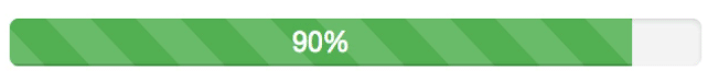
<div class="progress">
  <div class="progress-bar progress-bar-success progress-bar-striped" role="progressbar" aria-valuenow="90" aria-valuemin="0" aria-valuemax="100" style="width: 90%">
    90%
  </div>
</div>
Output:

Animated progress bar
We can add the .active class to .progress-bar-striped and create an animated progress bar.
<div class="progress">
  <div class="progress-bar progress-bar-success progress-bar-striped active" role="progressbar" aria-valuenow="90" aria-valuemin="0" aria-valuemax="100" style="width: 90%">
    90%
  </div>
</div>
Output:
Stacked progress bar
We can stack multiple bar into one progress bar. Keep the total percentage equal to 100%.
<div class="progress">
  <div class="progress-bar progress-bar-striped" style="width: 5%">
    <span class="sr-only">5% Complete (default)</span>
  </div>
  <div class="progress-bar progress-bar-info progress-bar-striped" style="width: 10%">
    <span class="sr-only">10% Complete (default)</span>
  </div>
  <div class="progress-bar progress-bar-success progress-bar-striped" style="width: 15%">
    <span class="sr-only">15% Complete (default)</span>
  </div>
  <div class="progress-bar progress-bar-warning progress-bar-striped" style="width: 20%">
    <span class="sr-only">20% Complete (default)</span>
  </div>
  <div class="progress-bar progress-bar-danger progress-bar-striped" style="width: 25%">
    <span class="sr-only">25% Complete (default)</span>
  </div>
</div>
Output:

ADVERTISEMENT