Bootstrap - Responsive Embed and Wells
Bootstrap

In this tutorial we will learn about responsive embed and wells in Bootstrap.
We use the responsive embed to allow browsers to determine video or slideshow dimensions based on the width of their containing block and maintain an essential ratio that will properly scale on any given device.
The responsive embed rules are directly applied to <iframe>, <embed>, <video>, and <object> elements.
We don't have to include frameborder="0" in your <iframe>s as Bootstrap will override that for us.
Responsive embed of 4:3 aspect ratio
To create a responsive embed of 4:3 aspect ratio we use the .embed-responsive-4by3 class.
<div class="embed-responsive embed-responsive-4by3">
  <iframe class="embed-responsive-item"
          src="https://www.youtube.com/embed/3OLTJlwyIqQ?rel=0"
          frameborder="0"
          allowfullscreen></iframe>
</div>
Output
Responsive embed of 16:9 aspect ratio
To create a responsive embed of 16:9 aspect ratio we use the .embed-responsive-16by9 class.
<div class="embed-responsive embed-responsive-16by9">
  <iframe class="embed-responsive-item"
          src="https://www.youtube.com/embed/6jJHw9YJnQY?rel=0"
          frameborder="0"
          allowfullscreen></iframe>
</div>
Output
Responsive embed is ideal for embedding YouTube video on your blog and website and it will scale depending on the device.
Wells
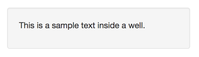
We use wells to give an inset effect to an element. To create a well use use the well class.
<div class="well">
  <p>This is a sample text inside a well.</p>
</div>
Output
Well sizing
We can use the .well-lg class to create a large well and .well-sm class to create a small well.
<!-- large well -->
<div class="well well-lg">
  <p>Text inside well-lg</p>
</div>

<!-- small well -->
<div class="well well-sm">
  <p>Text inside well-sm</p>
</div>
Output

ADVERTISEMENT