Bootstrap - Buttons
Bootstrap

In this tutorial we will learn to style buttons in Bootstrap.
Button class
We can use the .btn class on an <a>, <button> and <input> elements.
<a class="btn btn-default" href="#" role="button">Link Button</a>
<button class="btn btn-default" type="submit">Button</button>
<input class="btn btn-default" type="button" value="Input Button">
<input class="btn btn-default" type="submit" value="Submit Button">
Output:

Styling buttons
We can use the following classes to type buttons.
Use the classes to provide visual aid to the user.
| Class | Description |
|---|---|
.btn-default | This will create a default button. |
.btn-primary | This will create a primary action button. |
.btn-success | This will create a button to show success or positive action. |
.btn-alert | This will create an alert button. |
.btn-warning | This will create a warning button to indicate caution or warning. |
.btn-danger | This will create a danger button to indicate potential danger. |
.btn-link | This will make a button look like a link and de-emphasize it. |
<!-- default button -->
<button type="button" class="btn btn-default">Default</button>

<!-- primary action button -->
<button type="button" class="btn btn-primary">Primary</button>

<!-- button to indicate success or positive result -->
<button type="button" class="btn btn-success">Success</button>

<!-- button for alert messages -->
<button type="button" class="btn btn-info">Info</button>

<!-- button to indicate caution or warning -->
<button type="button" class="btn btn-warning">Warning</button>

<!-- button to indicate potential danger -->
<button type="button" class="btn btn-danger">Danger</button>

<!-- make a button look like a link and de-emphasize it -->
<button type="button" class="btn btn-link">Link</button>
Output:

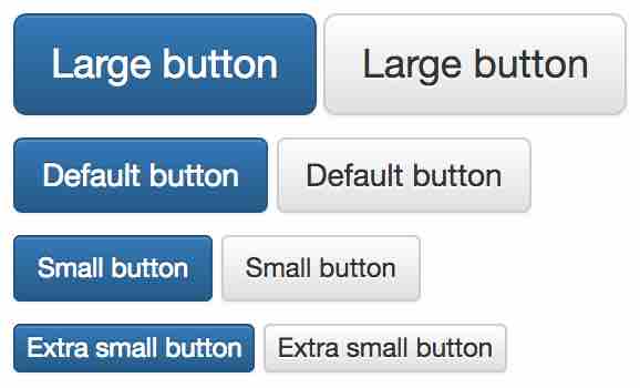
Button size
We can change the size of a button by using the following classes.
| Class | Description |
|---|---|
.btn-lg | This will make a large button. |
.btn-sm | This will make a small button. |
.btn-xs | This will make an extra small button. |
<p>
  <button type="button" class="btn btn-primary btn-lg">Large button</button>
  <button type="button" class="btn btn-default btn-lg">Large button</button>
</p>
<p>
  <button type="button" class="btn btn-primary">Default button</button>
  <button type="button" class="btn btn-default">Default button</button>
</p>
<p>
  <button type="button" class="btn btn-primary btn-sm">Small button</button>
  <button type="button" class="btn btn-default btn-sm">Small button</button>
</p>
<p>
  <button type="button" class="btn btn-primary btn-xs">Extra small button</button>
  <button type="button" class="btn btn-default btn-xs">Extra small button</button>
</p>
Output:
Block button
To create a button that span the full width of a parent we use the .btn-block class.
<button type="button" class="btn btn-default btn-lg btn-block">Block level button</button>
Output:

Active state
If we add the .active class to a button then it will look pressed.
<button type="button" class="btn btn-default btn-lg active">Button</button>
<a href="#" class="btn btn-default btn-lg active" role="button">Link</a>
Output:

Disabled state
If we add the .disabled class to a link then it will look unclickable. And if we add the disabled attribute to a button then it will also become unclickable.
<button type="button" class="btn btn-default btn-lg" disabled="disabled">Button</button>
<a href="#" class="btn btn-default btn-lg disabled" role="button">Link</a>
Output:

ADVERTISEMENT