Bootstrap - Panels
Bootstrap

In this tutorial we will learn about panels in Bootstrap.
In Bootstrap we use the panel when we want to put the DOM in a box.
Simple panel
To create a panel we use the .panel class and we use the following classes to style it.
.panel-defaultthis is for default panel.panel-primarythis is for primary panel.panel-successthis is for success panel.panel-infothis is for info panel.panel-warningthis is for warning panel.panel-dangerthis is for danger panel
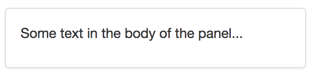
Inside the panel we have the .panel-body class which hold the body of the panel.
<!-- default panel -->
<div class="panel panel-default">
  <div class="panel-body">
    <p>Some text in the body of the panel...</p>
  </div>
</div>
Output:
Panel with heading
To add heading to a panel we use the .panel-heading inside the .panel.
<!-- default panel -->
<div class="panel panel-default">
  <div class="panel-heading">
    <p>This is the heading</p>
  </div>
  <div class="panel-body">
    <p>Some text in the body of the panel...</p>
  </div>
</div>
Output:

Panel title
We can even add the .panel-title class to the heading of the panel.
<!-- success panel -->
<div class="panel panel-success">
  <div class="panel-heading">
    <h3 class="panel-title">This is the title</h3>
  </div>
  <div class="panel-body">
    <p>Some text in the body of the panel...</p>
  </div>
</div>
Output:

Panel with footer
To create footer in a panel we use the .panel-footer class.
<!-- success panel -->
<div class="panel panel-success">
  <div class="panel-heading">
    <h3 class="panel-title">This is the title</h3>
  </div>
  <div class="panel-body">
    <p>Some text in the body of the panel...</p>
  </div>
  <div class="panel-footer">
    This is the footer
  </div>
</div>
Output:

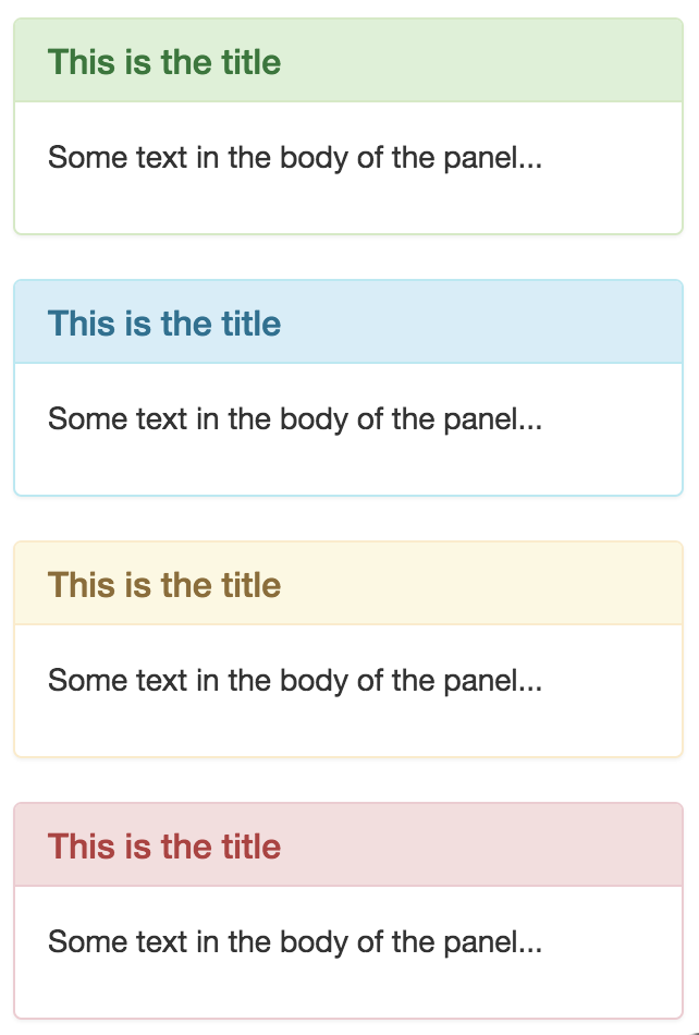
Contextual alternatives
Different panel types.
<!-- success panel -->
<div class="panel panel-success">
  <div class="panel-heading">
    <h3 class="panel-title">This is the title</h3>
  </div>
  <div class="panel-body">
    <p>Some text in the body of the panel...</p>
  </div>
</div>

<!-- info panel -->
<div class="panel panel-info">
  <div class="panel-heading">
    <h3 class="panel-title">This is the title</h3>
  </div>
  <div class="panel-body">
    <p>Some text in the body of the panel...</p>
  </div>
</div>

<!-- warning panel -->
<div class="panel panel-warning">
  <div class="panel-heading">
    <h3 class="panel-title">This is the title</h3>
  </div>
  <div class="panel-body">
    <p>Some text in the body of the panel...</p>
  </div>
</div>

<!-- danger panel -->
<div class="panel panel-danger">
  <div class="panel-heading">
    <h3 class="panel-title">This is the title</h3>
  </div>
  <div class="panel-body">
    <p>Some text in the body of the panel...</p>
  </div>
</div>
Output:
Tables inside a Panel
In the following example we have added a table inside a panel.
The .panel-body can be removed if not required.
<!-- default panel -->
<div class="panel panel-default">
  <div class="panel-heading">
    <h3 class="panel-title">Superheroes</h3>
  </div>
  <div class="panel-body">
    <p>Username of the superheroes...</p>
  </div>

  <div class="table-responsive">
    <table class="table">
      <tr>
        <th>#</th>
        <th>Username</th>
      </tr>
      <tr>
        <td>1</td>
        <td>Superman</td>
      </tr>
      <tr>
        <td>2</td>
        <td>WonderWoman</td>
      </tr>
      <tr>
        <td>3</td>
        <td>Batman</td>
      </tr>
    </table>
  </div>
</div>
Output:

Panel with list group
We can even include .list-group inside a .panel.
<!-- default panel -->
<div class="panel panel-default">
  <div class="panel-heading">
    <h3 class="panel-title">Superheroes</h3>
  </div>
  <div class="panel-body">
    <p>Username of the superheroes...</p>
  </div>

  <ul class="list-group">
    <li class="list-group-item">WonderWoman</li>
    <li class="list-group-item">Superman</li>
    <li class="list-group-item">Batman</li>
  </ul>
</div>
Output:

ADVERTISEMENT